A basic challenge in mobile games is dealing with varying screen sizes and resolutions. This post is a quick demo and writeup playing with the Pixi.js 2D graphics library for HTML5 games, showing how to scale a fixed-size game worldview to fit a given display, whether it be a device screen or a container on a page. In doing so it leverages some Pixi features to use upscaled resources for Retina and other high resolution displays. The demo also illustrates some basic mechanisms for sprite animation and parallax scrolling in Pixi v3, as well as preparing spritesheets using TexturePacker.
Questions are best posted to the HTML5 Game Devs Pixi forum, where many people, including Pixi.js developers, may answer them. But I’ll attempt to address any raised in the comments here. Suggestions and corrections are of course also welcome!
Flappy Monster
The demo is running here, or you can load it on its own, or view the source:
If everything has worked, there should be a monster endlessly flying across the screen as background and foreground graphics scroll along.
Aspect Ratio
The goal here is a common game design in which either the conceptual game world has a fixed size and is viewed in its entirety, or there is a fixed-size view into a larger conceptual game world. In either style that view is then scaled when drawn to fit the screen or display space as best as possible without cutting anything off or changing the aspect ratio (width divided by height). This frequently results in the “black bars” seen in videos or many mobile games, as part of the display is unusable unless the aspect ratios of the view and available display space match.
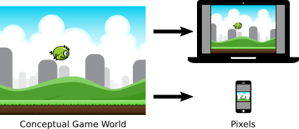
The fixed-size conceptual world, or a view of it, is mapped to the pixels of the display in use.
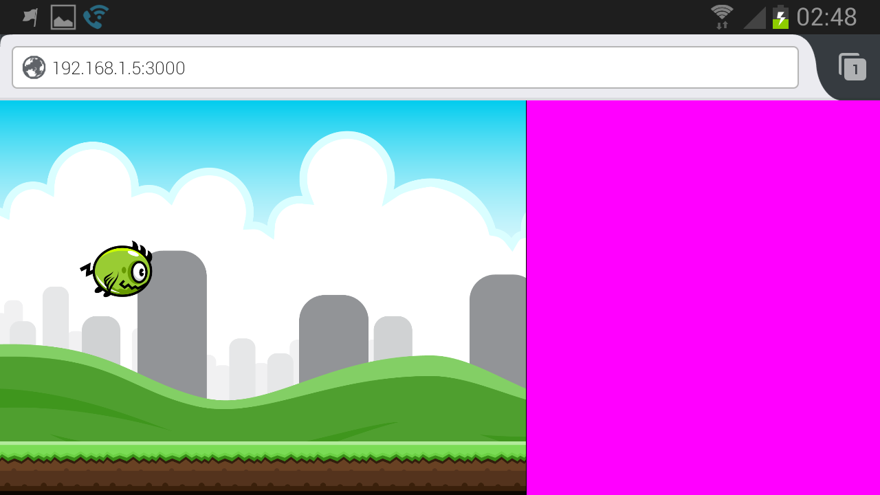
This demo has a conceptual world of 800×600 units, viewed in its entirety. When the monster flies off the screen and wraps around, it’s moving in and testing against a world 800 units wide. The instance displayed above has been fixed to a display of 480×360 pixels and the drawing scales accordingly. There is no dead space because the aspect ratios match. If you bring up the demo by itself in your browser, it will scale to fill the screen and re-scale if you change the window size. On my Samsung S3 it does the same according to my current device orientation:
Landscape orientation.

Portrait orientation.
The pink areas there are the dead “black bar” spaces that can’t be utilized without changing the aspect ratio or cutting off content. In an actual game these would be actually black, or house some decorative graphics or even game UI elements.
Renderer & Scaling
The demo instantiates a Pixi renderer and a top level stage container as follows:
        var rendererOptions = {
          antialiasing: false,
          transparent: false,
          resolution: window.devicePixelRatio,
          autoResize: true,
        }

        // Create the canvas in which the game will show, and a
        // generic container for all the graphical objects
        renderer = PIXI.autoDetectRenderer(GAME_WIDTH, GAME_HEIGHT,
                                           rendererOptions);

        // Put the renderer on screen in the corner
        renderer.view.style.position = "absolute";
        renderer.view.style.top = "0px";
        renderer.view.style.left = "0px";

        // The stage is essentially a display list of all game objects
        // for Pixi to render; it's used in resize(), so it must exist
        stage = new PIXI.Container();

        // Size the renderer to fill the screen
        resize();

        // Actually place the renderer onto the page for display
        document.body.appendChild(renderer.view);

        // Listen for and adapt to changes to the screen size, e.g.,
        // user changing the window or rotating their device
        window.addEventListener("resize", resize);
Scaling of the display is encapsulated in a function so that it can be called each time the screen changes, i.e., the window is resized, the game is sent fullscreen, or the device flips between portrait and landscape:
      function resize() {

        // Determine which screen dimension is most constrained
        ratio = Math.min(window.innerWidth/GAME_WIDTH,
                         window.innerHeight/GAME_HEIGHT);

        // Scale the view appropriately to fill that dimension
        stage.scale.x = stage.scale.y = ratio;

        // Update the renderer dimensions
        renderer.resize(Math.ceil(GAME_WIDTH * ratio),
                        Math.ceil(GAME_HEIGHT * ratio));
      }
Note that the autoResize option set in creating the renderer does not automatically install an event handler like this. Instead, it controls whether or not the CSS dimensions of the renderer are also set when its dimensions are changed, which is important in the next section.
All together, this code creates a Pixi renderer, then resizes it and scales the graphics to best fill the available display space.
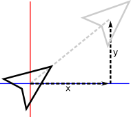
The first step in that resizing is calculating the scaling ratio, as determined by the most constrained axis. The ratios between each of the horizontal and vertical screen dimensions and the corresponding game worldview dimensions are compared, with the least ratio defining the most we can scale the game: That worldview dimension times the ratio equals the screen dimension. Note that in general this is not quite as simple as picking the smaller screen dimension and dividing, because of how game and screen aspect ratios may compare; e.g., a very tall game could be constrained by the height even in portrait orientation despite that being the long axis.
The stage is then simply scaled by that ratio. As it contains all of the objects to be drawn, this factor will be applied to every object as they’re drawn, scaling them from the game world to the screen.
Finally, the on-page renderer itself is resized to fill the most constrained dimension.
At this point, the game will scale appropriately on desktops to fill available space.
Viewports
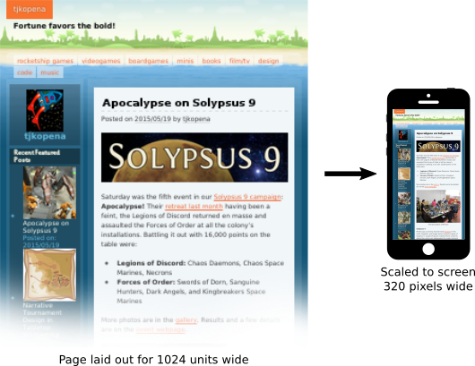
The next complication is managing browser viewports. Historically, a real issue in web design developed when smartphones initially became widespread. With their small screens and few pixels, web pages designed for typical desktop displays simply didn’t look or work correctly if laid out to the tiny handheld dimensions. So a viewport was introduced to the browsers. Exactly similar to the world scaling above, pages were laid out to conceptual dimensions similar to a desktop display to produce their expected look, and then scaled down when drawn on screen. This mapping step also enables other features, such as the page layout not continually changing as the user zooms in or out.
Viewports decouple page dimensions and layout from actual device display limitations or capabilities.
A consequence of the viewport is that by default the page dimensions visible to the game code on mobile devices may have little direct bearing to the actual physical display. They also vary widely by browser and device. The viewport meta tag must be used in the page’s head to direct the browser to report the actual screen dimensions and to not scale the page display:
    <!-- Viewport meta tag is critical to have mobile browsers
         actually report correct screen dimensions -->
    <meta name="viewport"
          content="width=device-width, initial-scale=1, user-scalable=no" />
The three options there respectively tell the browser to set the viewport as the same size as the screen, not to scale it, and not to let the user scale it either. With that specification the browser will report the screen dimensions, and the earlier code will scale the game appropriately even on mobile devices. Success!
Hi-Res
The next step is accounting for pixel density. Most upper end mobile devices today actually have many pixels compared to traditional displays, even if the screens are physically still small. The browser variable window.devicePixelRatio reports this resolution. On standard desktop displays it’s a 1, and on high resolution displays such as a smartphone it will typically be 2 but perhaps another value.
The code above already accounts for pixel density in its calculations. Despite the viewport settings, mobile browsers still don’t report the actual screen dimensions via window.innerWidth and window.innerHeight, but instead a virtual page size scaled from the screen by the inverse of window.devicePixelRatio. So, in portrait mode with those viewport settings, a Samsung S3 reports a window width of 360 units even though the screen is 720 pixels wide. However, the device pixel ratio is passed to Pixi via the resolution renderer option, which scales the canvas to compensate.
Another consequence of high resolution devices is that images may deteriorate when scaled to suit those large pixel counts. Sometimes this isn’t a problem, but Pixi makes it easy to swap in higher resolution assets when appropriate. In loading an image or spritesheet, if Pixi detects an “@2x” in the filename, it interprets the asset as a high resolution graphic; e.g., in loading the monster:
        if (window.devicePixelRatio >= 2) {
          loader.add("monster", "monster@2x.json");
        } else {
          loader.add("monster", "monster.json");
        }
From there the game code can largely forget about this detail. In particular, the sprite’s width and height are adjusted by that resolution and report the same dimensions as the standard version. Internally though, between Pixi and the browser, when the graphic is rendered, the high resolution source image entails that the image does not have to be scaled (as much) to output to the high resolution device, resulting in a crisp(er) image. In the code above, the autoResize renderer option is needed to have Pixi adjust the canvas element’s CSS styling in order to make this work correctly.
Standard and hi-res spritesheets for the monster.
Animation
With the renderer set up appropriately and the spritesheet loaded, it is then easy to display and animate the monster. For this trivial demo, several global variables are created, along with a hardcoded list of frame names defined in its spritesheet:
      var monster;
      var FRAMES = [
        "frame-1.png",
        "frame-2.png",
        "frame-3.png",
        "frame-4.png",
      ];
      var frameindex;
      var frametime;
      var FRAMERATE = 0.08;
      var VELOCITY = 100;
The monster is then instantiated, taking the first frame as its initial texture:
        // Create the monster sprite
        monster = new PIXI.Sprite(PIXI.Texture.fromFrame(FRAMES[0]));
        frameindex = 0;
        frametime = FRAMERATE;
        monster.anchor.x = 0,5;
        monster.anchor.y = 0.5;
        monster.position.x = -monster.width/2;
        monster.position.y = GAME_HEIGHT/2 - monster.height/2;
        stage.addChild(monster);
Note that the monster is positioned within the game world dimensions, not the screen dimensions. Because the resolution is automatically set on the graphic and its dimensions adjusted appropriately, and we’re retrieving the texture by the frame name in the spritesheet rather than the image filename, the detail of whether or not a high resolution asset is in use can be ignored. Additionally, because the standard image size is keyed to the conceptual game world dimensions, we can simply use that in centering and moving the monster.
A standard HTML5 animation loop is then established, calling an update and render function as fast as possible while matching the framerate of the display:
        // Prepare for first frame of game loop/animation
        lasttime = new Date().getTime();
        requestAnimationFrame(animate);
      function animate() {

        // Determine seconds elapsed since last frame
        var currtime = new Date().getTime();
        var delta = (currtime-lasttime)/1000;

        // Scroll the terrain
        background.tilePosition.x -= BG_RATE*delta;
        foreground.tilePosition.x -= FG_RATE*delta;

        // Move the monster
        monster.position.x += VELOCITY*delta;
        if (monster.position.x > GAME_WIDTH + monster.width/2) {
          monster.position.x = -monster.width/2;
        }

        // Animate the monster
        frametime -= delta;
        if (frametime <= 0) {
          frameindex++;
          if (frameindex >= FRAMES.length) {
            frameindex = 0;
          }
          monster.texture = PIXI.Texture.fromFrame(FRAMES[frameindex]);
          frametime = FRAMERATE;
        }

        // Draw the stage and prepare for the next frame
        renderer.render(stage);
        requestAnimationFrame(animate);
        lasttime = currtime;

      }
This function first moves the monster within the game world space, wrapping it around the edges. Rather than directly adding to its position, the monster has a velocity of 100 pixels per second. Multiplying that by the time elapsed since the previous frame and adding to its position calculates the monster’s new location in the game world. Applying this trivial kinematic formula deals with changes in frame rate and the update cycle on different devices and under varying processor loads, ensuring the monster always moves consistently.
The other component is a simple timer which triggers the monster’s texture being set to the next frame in its animation sequence every fraction of a second. This loops through the list of frames, producing the flapping animation. Pixi does include a MovieClip sprite component for doing basic animation in the same way, but many games require more direct access and manipulation of the animation, built on similar code as that here.
Parallax Scrolling
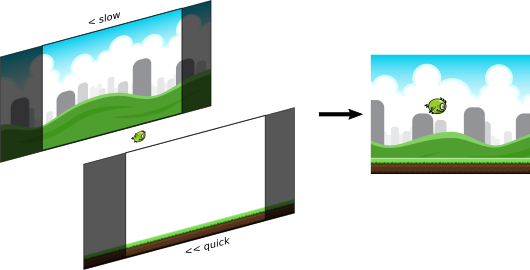
The monster of course needs a world to fly in. For this demo and even many basic games, it’s enough to have a simple image scrolling past. Pixi supports this readily via tiling sprites. The demo uses two of these, a background and a foreground, scrolling at different rates to create the illusion of depth via parallax, whereby the apparent positions of objects at a distance shift more slowly as the viewer moves.
These tiling sprites are instantiated and added to the display similarly to a regular Pixi sprite. One difference is that they take explicit width and height parameters defining the tiling sprite’s dimensions. The source graphics are then pattern repeated within that sprite as necessary to create the rendered image. In this demo the background sprite is sized to fill the whole screen, while the foreground is a single strip placed along the bottom edge:
        // Create the scrolling background
        background =
          new PIXI.extras.TilingSprite(PIXI.loader.resources.background.texture,
                                       GAME_WIDTH, GAME_HEIGHT);
        stage.addChild(background);

        // Create the scrolling foreground tile
        foreground =
          new PIXI.extras.TilingSprite(PIXI.loader.resources.foreground.texture,
                                       GAME_WIDTH,82);
        foreground.position.y = GAME_HEIGHT - foreground.height;
        stage.addChild(foreground);
Within the animation loop, the starting position of that pattern is then adjusted to make the images scroll:
        background.tilePosition.x -= BG_RATE*delta;
        foreground.tilePosition.x -= FG_RATE*delta;
The monster now appears to be flying above some grassy ground, with hills and towers in the distance behind!
Composition of the scene.
Assets
Finally, a note about assets and how they’ve been prepared.
The monster and background are both open game art by Bevouliin. Thanks to Bevouliin for publishing these great graphics for all to use!
The images were published as quite large raster graphics, which have been downsampled here for standard and double size hi-res versions to match the conceptual game world of 800×600. This was done using ImageMagick, e.g.:
mkdir sm
for i in frame-*.png; do convert $i -scale 10% sm/$i; done
The monster frames were then packed into spritesheets using TexturePacker, whose basic JSON texture atlas format Pixi understands. The images and atlas can be generated by the trial version with a command such as:
TexturePacker --png-opt-level 0 --algorithm "Basic" \
              --disable-rotation --trim-mode "None" \
              --format "json" --data monster.json   \
              --sheet monster.png                   \
              sources/monster/Transparent\ PNG/flying/sm/*
Note that the monster frames have been put into separate directories for standard and hi-res versions. The frame names derived from the filenames are then identical in both versions of the texture atlas, so the animation indexes are the same regardless of the display mode. The background graphics are simply different files for standard and hi-res versions. However, by using the resource handler created by Pixi’s loader rather than the image URLs, their instantiation code also does not have to be concerned with the display mode. See the source for these details.
Conclusion
That wraps up this simple demonstration. The full code is available here. Check out the Pixi v3 examples and documentation for more information about all the things it can do, and don’t forget about the HTML5 Game Devs Pixi forum.

