Recently I was working on a website layout using Bootstrap for which the design called for a large logo image as the navbar brand, with the navbar entries vertically centered with it. I thought “Yo, that’s crazy, there’ll be a lot of dead space in the navbar,” but the designer just said “Yo, I am crazy, do it.”
There’s many StackOverflow questions and blog posts on vertically aligning a Bootstrap navbar, but most of them don’t really work. Worse, all of the working solutions I found involved manipulating the line height of the entries. Unfortunately, that also fails with an additional crazy designer requirement: The navbar entries might be multi-line, so playing games with line-height thus wouldn’t arrange each entry’s text correctly. Eventually I was able to work out the details of another approach using table-cell, shown in this post. As is typical with HTML/CSS, especially with Bootstrap thrown in, and double especially regarding vertical alignment, the actual code is really short and seems obvious, but is much less so when trying to work out the magical incantation from scratch.
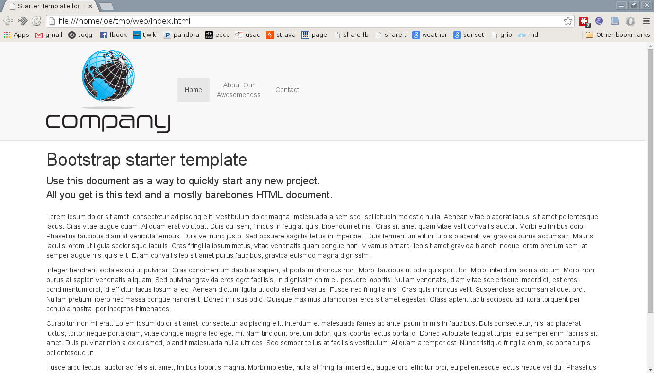
This demonstration is built on a Bootstrap’s Starter Templates, showing a navbar fixed to the top of the screen. I’ve just switched the navbar from navbar-inverse to navbar-default to use the lighter color scheme and added dummy text:
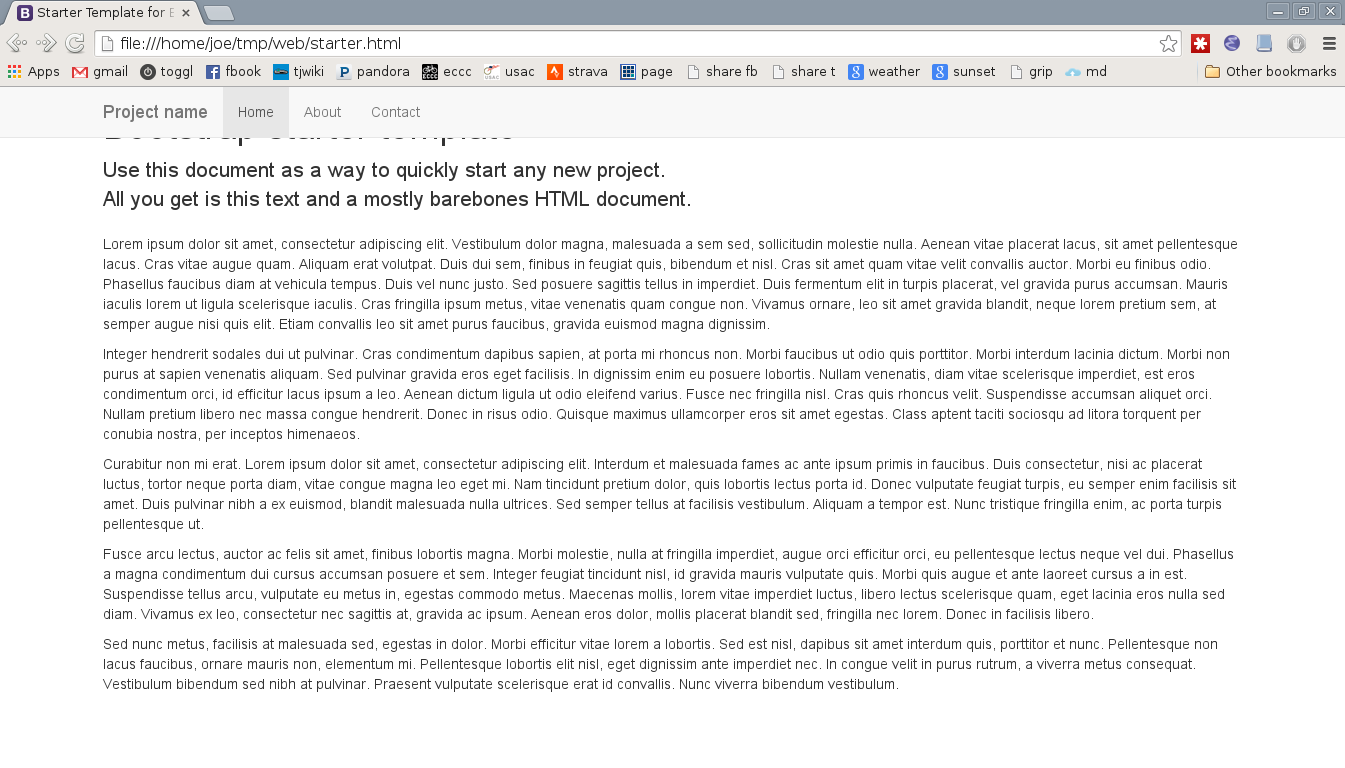 Note that the basic Bootstrap styling does not by default work with the fixed top, it obscures the page title. This is fixed in the last step of this demo.
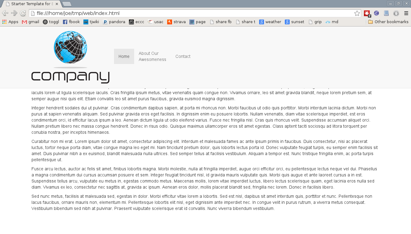
Next I change the brand (“Project Name” in the template) to a large logo image and made one of the menu entries multi-line by fixing the width of the entries. The logo especially doesn’t work out well:
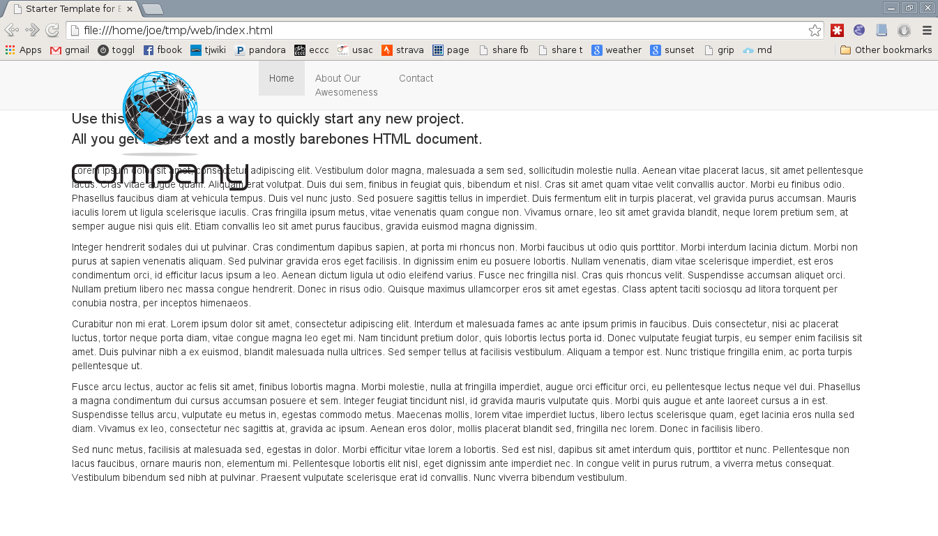
Adjusting the Bootstrap navbar’s height requires adjusting the height of both the navbar and navbar-header class entries. The latter is used when the navbar is collapsed for small screens, to start the nav menu rolldown at the right place. Bootstrap’s default navbar brand top and bottom padding is 15px, so for my logo I increase the minimum height to 202px, 30px more than its height:
.navbar        { min-height: 202px; }
.navbar-header { min-height: 202px; }
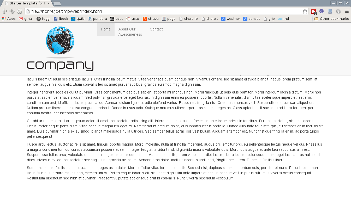
Moving on to the actual objective here, the first step is to vertically align the navbar entries among themselves along their middles. The easiest, most elegant way to do this is to change their display style to table-cell, which respects the vertical-align: middle property. There are two gotchas to this: The parent list must be set to display: table-row mode, and, more obscurely but sensibly in retrospect, the cells cannot be floats. Note that, unlike a few comments I did find, the parent container does not need to be in mode display: table. Thus:
      #navbar > ul {
      display: table-row;
      }

      #navbar > ul > li {
      display: table-cell;
      float: none;
      vertical-align: middle;
      }
At this point the whole navbar line just needs to be shifted downward to center it with the logo. There is probably some convoluted mechanism or arcane invocation to do this automatically, but I’ve just been doing it by hand. To keep calculations simple I first add the padding to the navbar, and then shift the row down:
      #navbar {
      padding-top: 15px;
      }

      #navbar > ul {
      padding-top: 48px;
      }
Note that for middle alignment it’s not necessary to set the height of the row, it just needs to be moved down by the padding.
After that the last tweaks are to center the cells and shift the page contents down below the heightened navbar:
      #navbar > ul > li {
      text-align: center;
      }

      body {
      margin-top: 202px;
      }
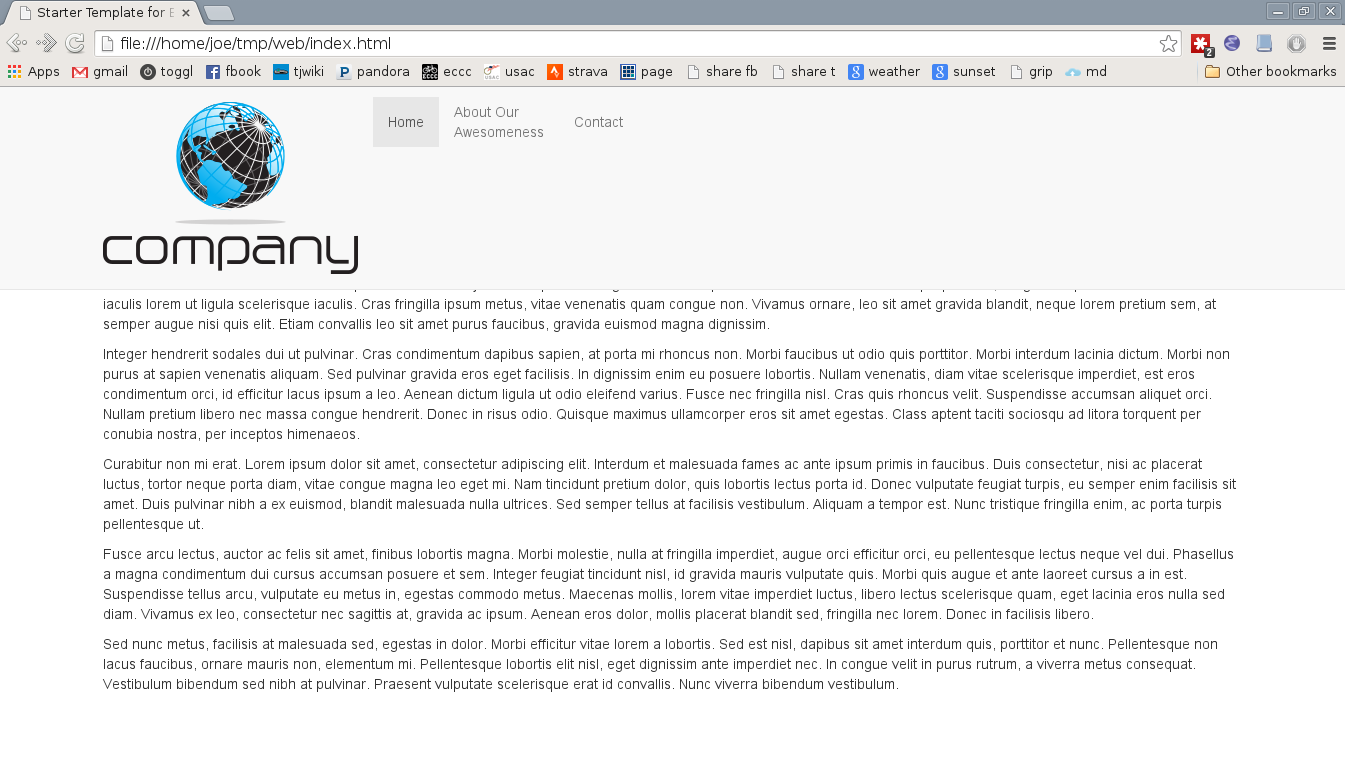
Unfortunately this doesn’t really work well when the navbar collapses into the mobile navigation list dropdown:

To address that, all of the above needs to be wrapped in a media query such that the stylings only take effect when the navbar is not collapsed. By default in Bootstrap this is when the window is at least 768px wide:
      @media (min-width: 768px) {

        #navbar {
        padding-top: 15px;
        }

        #navbar > ul {
        display: table-row;
        padding-top: 48px;
        }

        #navbar > ul > li {
        display: table-cell;
        float: none;
        vertical-align: middle;

        text-align: center;

        width: 80px;  /* crazy designer's fixed-width, multi-line entries */
        }
      }

And with that, the objective of vertically centering multi-line entries with a large logo in a Bootstrap navbar is accomplished. #victory!