I’ve been playing X-Wing miniatures for all but literally a year now, starting just before last year’s X-Mas Wing Tournament @ Redcap’s. That whole time I’ve largely been employing a particular style of build and practicing literally just a couple different squadrons that have turned out to work pretty well. To mix things up, have a slightly less hard-hitting squad for more casual play, and to fly some more off the wall stuff, I put together a new list and then painted up a whole squadron to match. Here I present some glamour photos, but more importantly a tutorial walkthrough of the process in hopes it helps newcomers interested in giving repaints a try.

The Spice Pirates Patrol squadron.
Spice Pirates Patrol
I present the Spice Pirates Patrol:
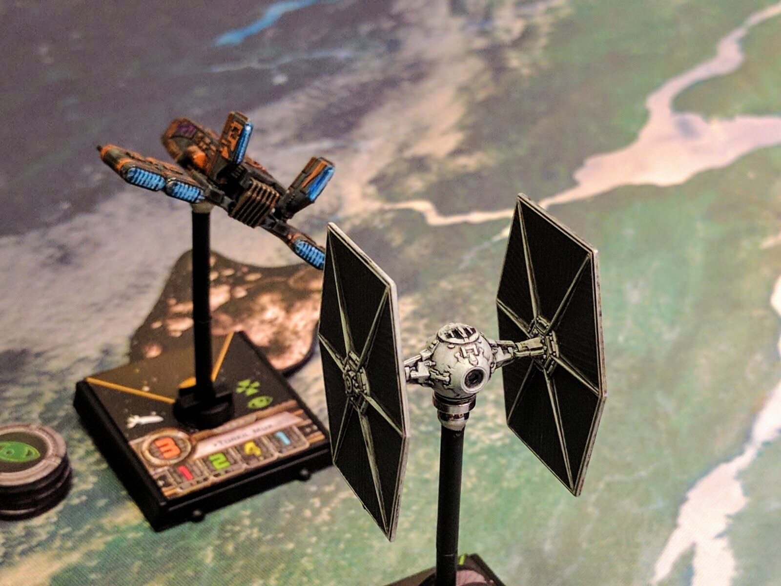
- HWK-290: Torkhil Mux w/ Blaster Turret, Recon Specialist, Moldy Crow, Hull Upgrade
- Y-Wing: Kavil w/ Twin Laser Turret, Unhinged Astromech, Veteran Instincts
- Z-95: Binayre Pirate
- Z-95: Binayre Pirate
- Z-95: Binayre Pirate
Is this a great list? It’s ok, but not great or super competitive. I’m sure I’ll be tweaking it. Comparing to my standard rubric: Hull+shields is a bit low, average agility is a bit inferior, and damage output once you factor in the turrets is above average but not amazing. The real weaknesses I’ve found so far though are that the squadron isn’t very maneuverable, the Z-95s die easily, and they have to prioritize blocking over jousting, which is a harder skill. So I’m not planning to take it to any tournaments, but after just a couple games it seems to be competent for casual play, fun to fly, and probably not a setup you’re likely to see another of on the local tables.
All of that’s not really the point though. The design rationale for this squadron was:
- I’m hosting a beginners’ night next week, what can I fly that’s fun and credible but not overly strong?
- In a year of playing I’ve never ever used this Z-95 I bought, can I flip it to Scum and use it there?
- The shop is way overstocked on HWKs, they’re on sale, and I love them, how can I justify another one?
- Most Wanted is also on sale, what’s a neat list that will use all of that plus another HWK and my Z-95?
And here we are. Obviously I couldn’t have a Rebel Z-95 mixing with some Scum, or two Moldy Crows in my fleet, so in a fit of late night and early morning inspiration I repainted them all to match. Later they got magnetized as well. So far I’ve had a couple fun, close games with the squad, and am happy with the whole project.
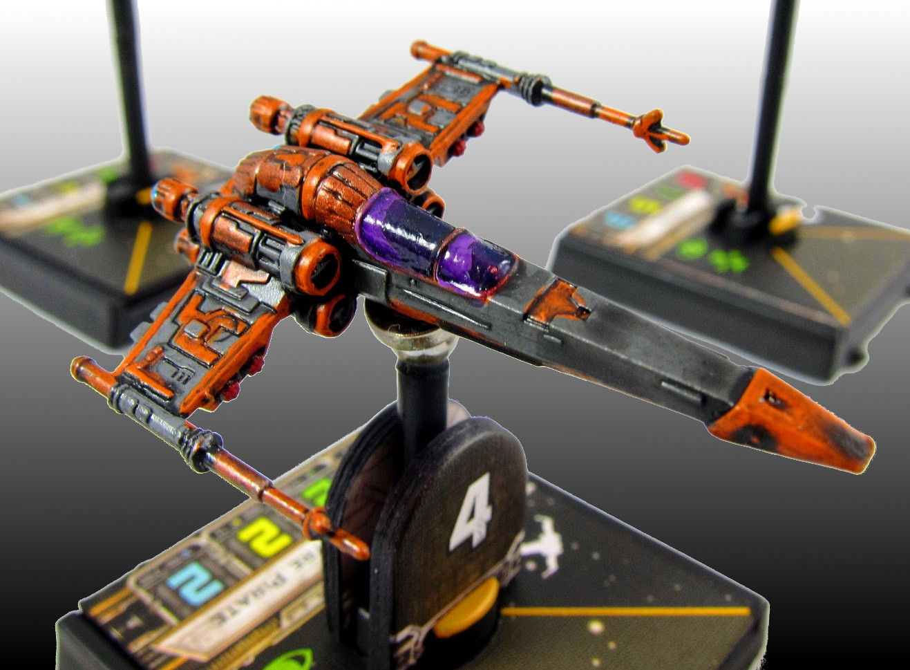
Z-95 #4.
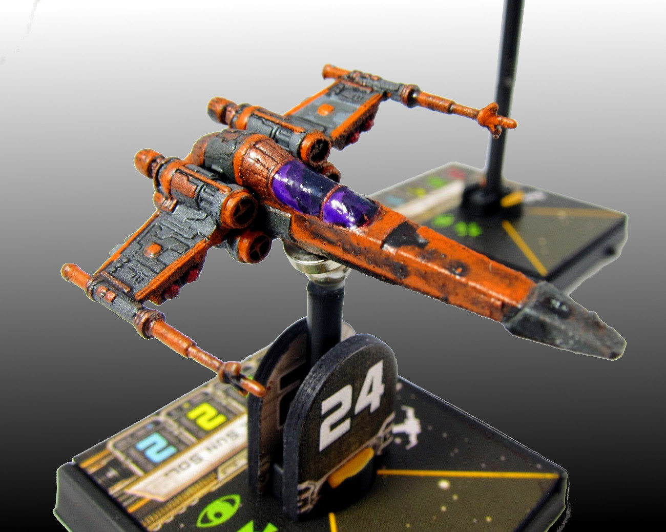
Z-95 #24.
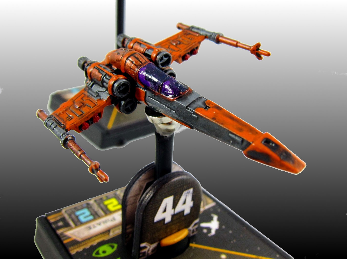
Z-95 #44.

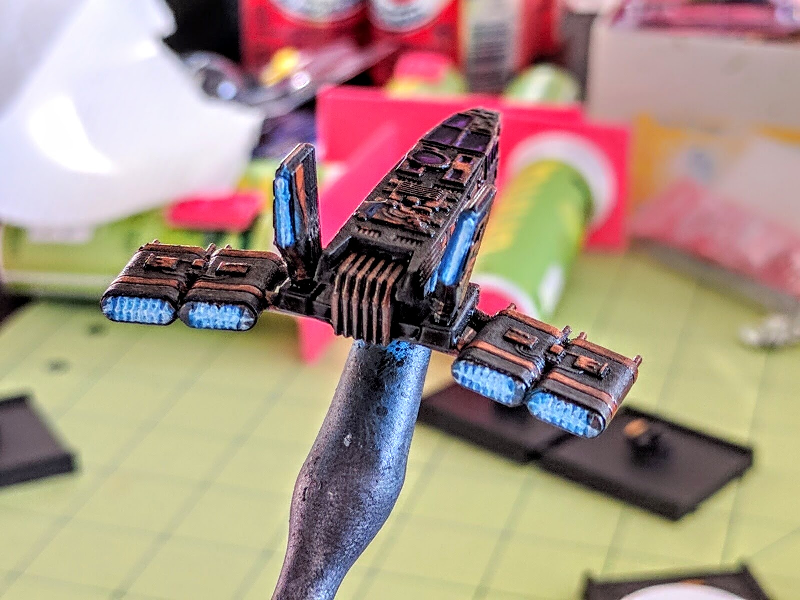
Kavil’s Y-Wing, engines spewing ions.
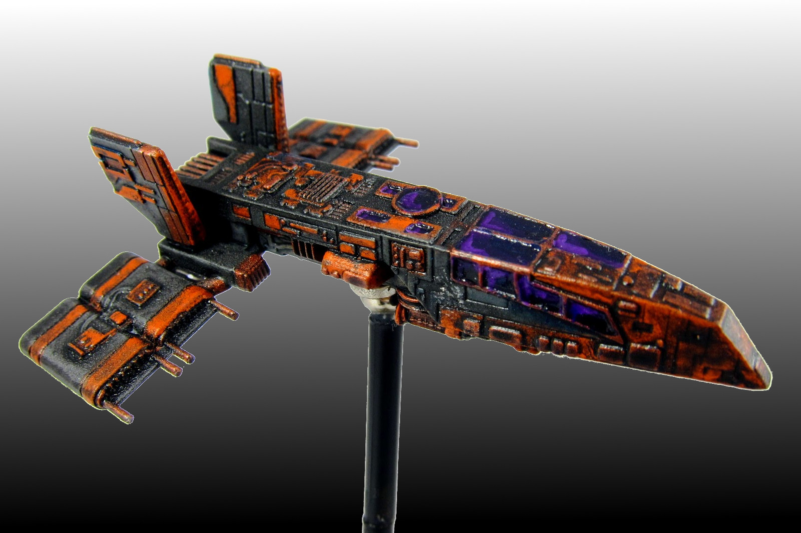
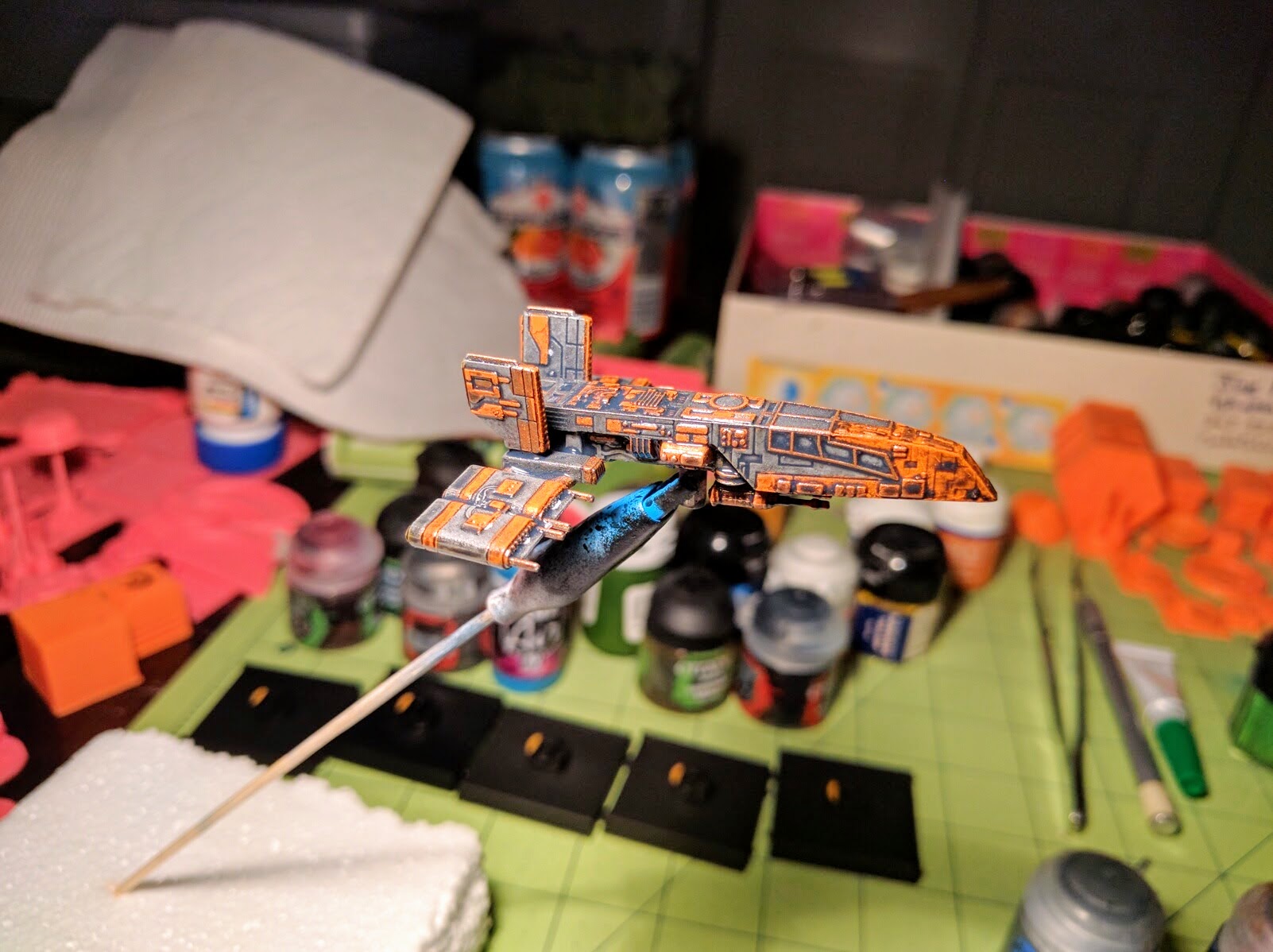
Torkhil Mux’s HWK-290.
Repaint
I’m writing up this repaint because I think it came out well and the local reception has been very positive, but it was really fast and easy. I’m an average miniatures painter in raw skills, but I get what I think are hopefully just-above-average results by being smart about the process and using some basic “tricks.” Anybody can get at least the same quality outcomes, and you should give it a try if you’re interested!
Bases
First up, black out your ship inserts, bases, and pegs. I’ve done this for all my ships, all my tokens and templates, even my damage deck, and it really boosts the visual appeal of any squadron. All the cardboard bits you can do with just a standard Sharpie or similar small-point permanent marker. The bases and pegs I spray paint black. Hit the bases diagonally from one direction, let them dry, rotate them 180 degrees, hit them again, and you’re done. I use alligator clip sticks to hold the pegs for spraying and drying so that the fine paint doesn’t get marred by handling them. I use these similarly for the ships as well, which you’ll see below.
The real trick on the bases though is to spend a minute and paint the front of the peg holder in a color to match the arc on the ship insert (red for Rebel, green for Imperial, yellow for Scum). This makes the base really pop visually, and as a bonus eliminates the hassle of trying to figure out which way is forward (you of course won’t be able to see from above the arrow included on the underside once you paint the base).
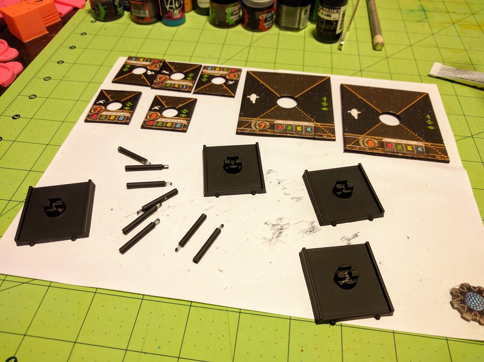
Sides of the cardboard pieces have all been blacked out with a Sharpie, while the bases & pegs have been spray painted.
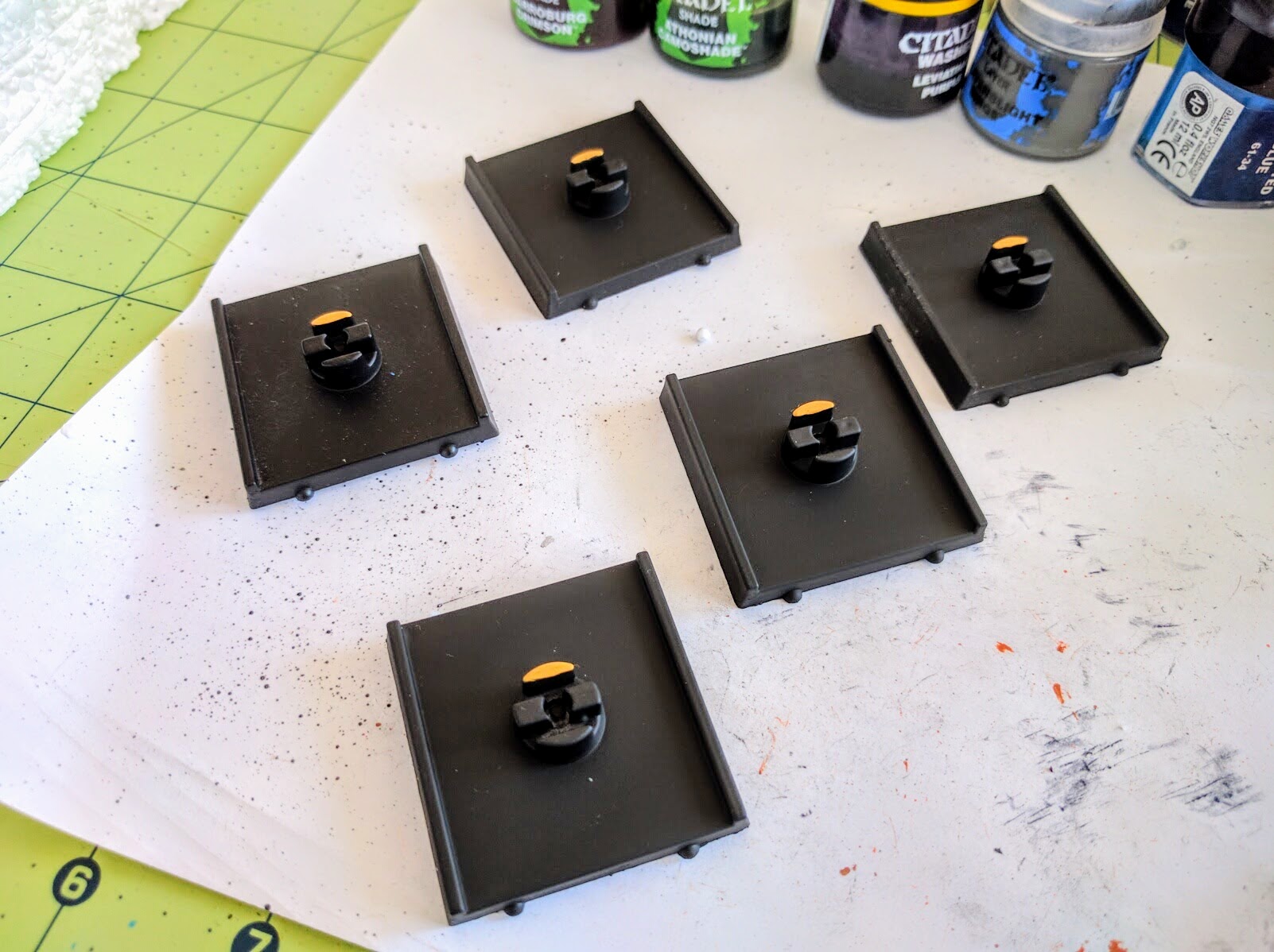
Great small touch: Paint the peg holders to match the arcs on the ship cards.
Primer
Next up is priming the ships. It’s not worth trying to strip off the existing paint jobs. The paint and plastic used makes it very hard to remove, the pieces are delicate and not prone to scrubbing, and it’s all a very thin coat anyway. It’s just not worth it. In many cases you may not even want to prime the ship if you’re just reworking some areas.
However, these ships all had a variety of stock paint jobs. I wanted to be sure the repaint started from a consistent base so they all wound up matching, so they had to get primed. For models with such fine details you want to be very wary of putting on too many coats of paint, so rather than the black or white I use for most miniatures and then painting on colors, I spray primed these directly in the grey base I wanted.
A wide variety of fancy primers are available specifically for miniatures. The big appeal of these is that they adhere well to models, but are very thin, preserving the detail. The big downside is they’re expensive, and the cans don’t last very long. I just use cheap, everyday matte spray paints found in the hardware store around the corner. I don’t always use paints specifically marked as primers, though in this case I did.
In using standard spray paints, the big thing to keep in mind is the necessity of keeping the paint thin. Spray at a good distance from the model (maybe 12–16″ or so), and in quick but steady passes and just one or two at a time. If you need to hit another angle or need another layer, wait until everything dries and then rotate the model and do another quick, thin pass. I used the alligator clip sticks mentioned above to hold the models for this so I could rotate them while spraying and prime all angles in one go.
If you’re new to all this, or using a new paint, start with the model you care about least. In this case I started with a Z-95 to make sure the paint wouldn’t be too thick, because in event of catastrophe that would be less of a loss than if the Y-Wing or HWK got messed up. In actuality here the first couple shots out of the can did fuzz up a bit on the underside of the model, but not enough to be visible in play even if it were on top.
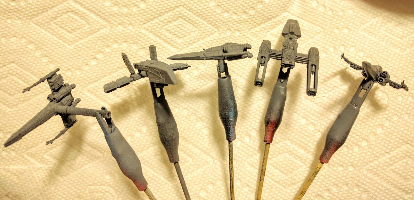
Spray primed models.
Base Colors
An important “trick” in getting nice, classy miniatures without a ton of work is just to keep it simple and obvious. Use just two high contrast colors as the base, pick out some other details, and call it a day. It’ll look great. Multicolor schemes, complex patterns, etc., should all be saved until you’re sure you know how to make it work.
Here I went with orange as a second color to contrast well with the grey base. Orange is also my favorite color, seems reasonably associated with “spice,” and isn’t strongly associated with either Rebels or Imperials. I basically just went around each ship more or less arbitrarily picking out section of hull, panels, and some details in orange. On the Zees I made a conscious decision to have them be consistent and similar to each other but not precisely matching.
Just like with the spray primer, it’s important with such fine details to keep the paint thin. You generally really need to start with miniatures-specific paint, and even then often need to additionally thin it a little bit with water. I use an eyedropper and an old brush to carefully put in and mix just a few drops of water into the pot. Try your paints on a piece of paper or other scrap material first. If you feel like the paint might be thick and globbing on, then it is and needs to be thinned. Depending on the color it’ll take multiple coats to get it solid but not overwhelm the details. Here the orange bits were generally two coats and three on the larger sections.
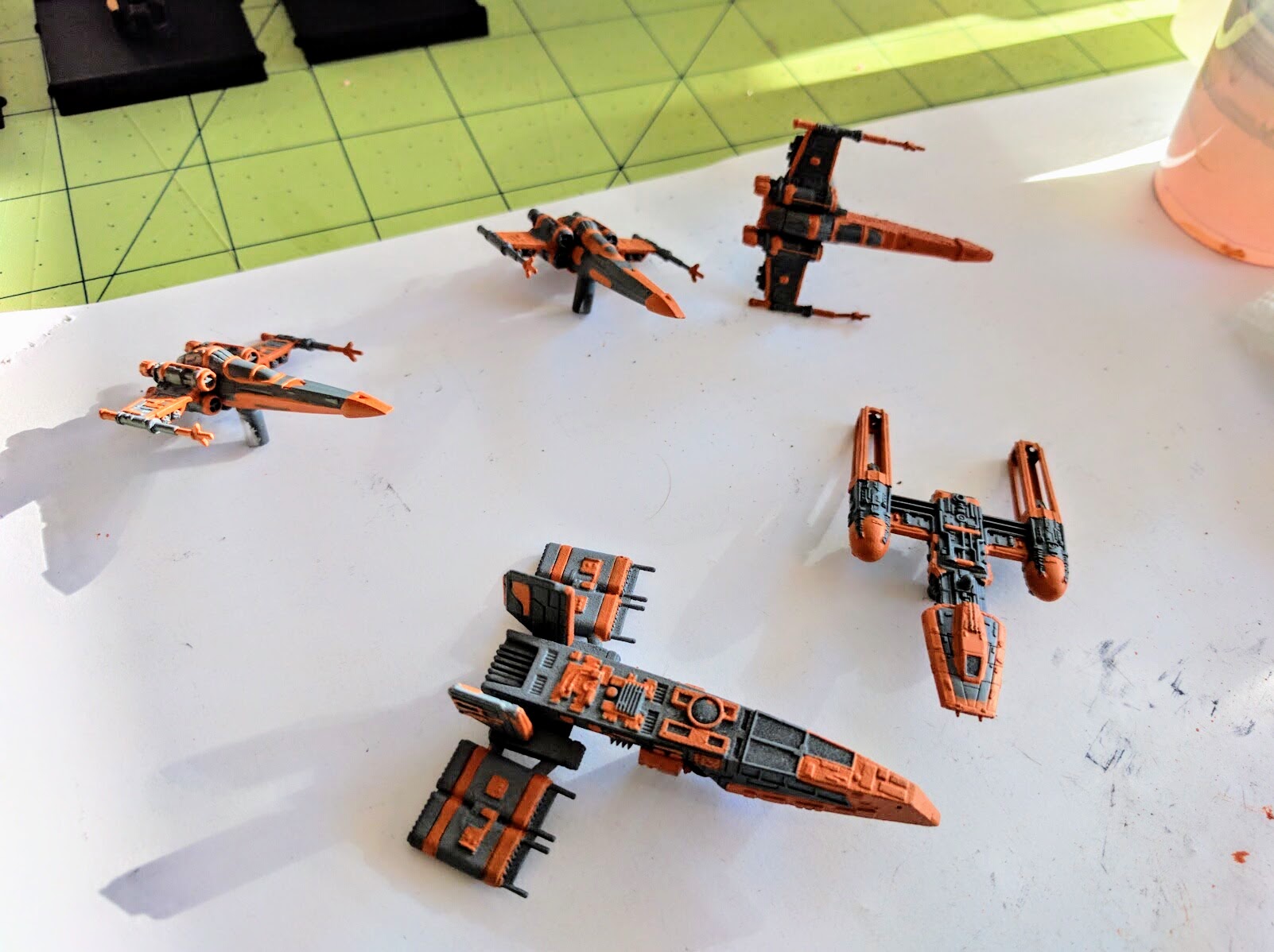
Sections of hull, plating, and some details painted orange.
Next I painted some of the other plating, window frames, piping, and other details in brass. The rationale for this choice was that brass would contrast well with the grey base, but complement the orange sections. From a distance the orange and brass blend together, so the ship just looks grey and orange with some subtle texture to the latter. On closer inspection though, the mechanical details pop out in brass.
Details picked out in brass.
Wash
The next big step is just to wash everything. A lot of people default to almost always using a black wash. I encourage you to step back and think about that for a moment though before plunging in. Often a brown or a green will work better. For example, some DX-9 Stormtrooper Transports I also painted up recently for an narrative event came out fantastic after picking out some panels and details and then just doing a heavy brown wash. It gave exactly the worn, battle weary look I wanted, whereas the couple I did in a black wash for variety’s sake are also well shaded but don’t have the same kind of immediate natural, intuitive interpretation.
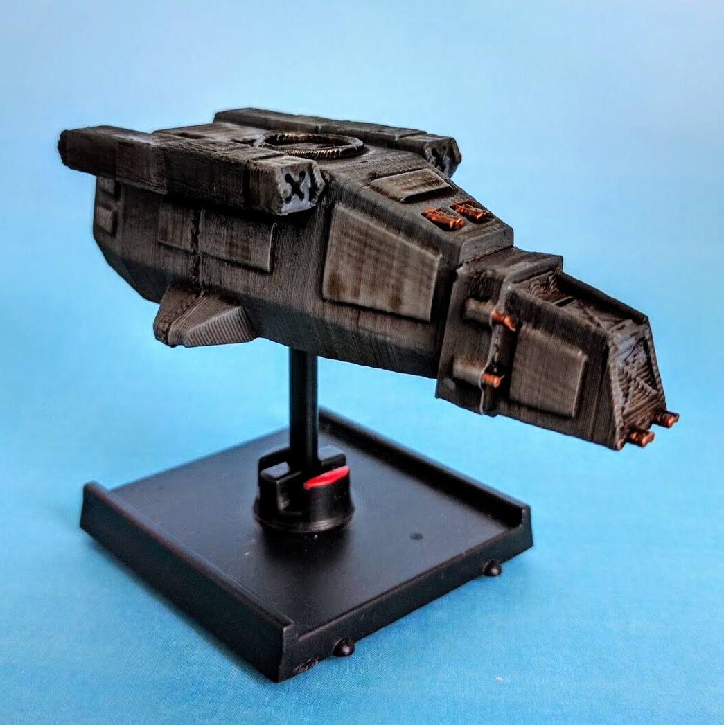
Note the brown wash on this DX-9 Stormtrooper Transport.
For the Spice Pirates though I went with a black wash. The ships and consequently their surfaces and panels are small so I was mostly going for simple shading rather than wear, corrosion, or some other natural interpretation. I knew the black would look good on the orange and brass but I wasn’t sure a brown would. I also wanted to bring the overall tone down and really darken the grey, which a brown wash wouldn’t do as much. The HWK in particular I wanted to be darker, with a feeling of being a black shadow supporting the squadron. After this photo it got several additional washes to visibly darken it more than the others but not lose the grey/orange scheme.
First black wash on the HWK.
Windows
At this point the ships already look good and are very flyable. But I did just a couple more details, starting with the windows. Here I added just a hint of another color by choosing purple. I thought that would work well because it contrasts with the orange and brass, and is dark enough to fit in with the grey and not create a jumble of colors.
These I did quickly in three steps. First is a dark purple base. Then I lightened just a couple brushfuls of that by mixing in a white, and painted half the windows. You’re trying to create some vague notion of light on the surface, so apply this lighter color all in a consistent pattern on the different panels as though it were from light hitting from a particular angle. Then I lightened up that paint again with some more white and applied some purple-pinkish highlights in the corners. All of the window panels were then carefully covered with a dark purple wash to bring the colors back down and blend the three layers just a bit (not pictured).

Dark purple window base.

Lighter shade of purple.

Brighter purple window highlights.
Engine Glow
The next big detail is engine glow. Even a half competent job at this can bring a lot to the look of a ship, particularly in photographs. I start with a solid deep blue base over which I sloppily drybrush a brighter blue. I then brighten up a couple drops of that blue with some white and drybrush that in the centers. Finally the engines get washed in a blue to bring the colors back down a bit and re-emphasize any texture depth. You may not want to do that step if you want your engines to burn very brightly.

Starting the engines with a solid blue.

Drybrushing a bright blue.
Adding white-blue highlights.

Washing the engines with a dark blue.
It’s worth noting that I went way overboard, perhaps nonsensically so, with the engine glow on the Y-Wing. My conception, going along with not just Scum in general but the Unhinged Astromech in particular, is that this is a beat up old ship that’s been hot rodded. I assume they’ve got the engines chopped and tuned to get those green 3 maneuvers, prioritizing raw max power over efficiency and safety. So its engines are just spewing ions and magical Star Wars go-juice in a cloud behind the outlets.
Final Details
Wrapping up the painting are just a couple details. As I go through the steps of painting base colors, washing, etc., I make a line of paints on my work area as a to-do list of the different bits to be done and colors to use. For this project I started that while doing the black washes, as I was looking at the whole of each ship, so I wound up with a line of purple for the windows, blues for the engines, and then a few odds and ends. Some of those here are red for the missile heads on the Z-95 wings (I assume that’s what they are), green for the Y-Wing’s astromech, and black for the peg holders.
So far I have not blacked out the magnets. Mostly I just haven’t gotten to it yet, but I also think the paint will grind off very quickly. For the heavier or larger ships—the HWK in this squadron—a layer of paint might also be just enough to impair the attraction sufficiently to make them fall off the stand a bit more easily.

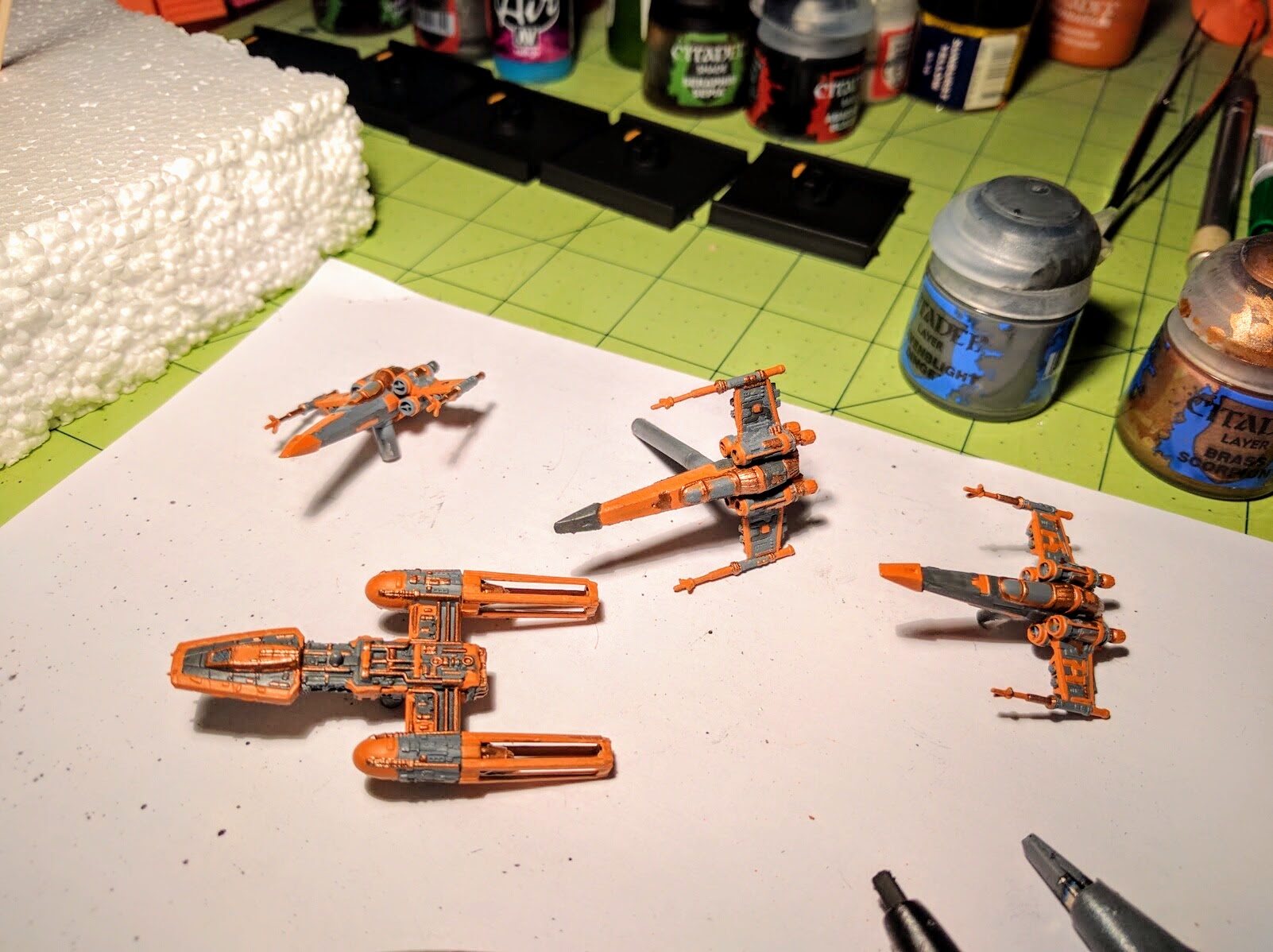
Paint line to-do list.

Everything drying after some additional washes and final touches.
Sealing
Last but not least, I seal everything with a matte spray dull coat. On a plastic miniature there’s not normally a great danger of paint being rubbed off, but in X-Wing the miniatures arguably get more handling than normal so it’s maybe more of a risk. Either way, the dull coat reduces the shinyness that washes in particular tend to create.
However, I also wanted the windows and engine glow to keep more of a sheen. So after the dull coat I used a brush-on gloss coat to make the windows shimmer just a little bit as the light plays across them, and the engines to pop a bit in photographs.
Color List
UPDATE: There was a request for the color list for this repaint, so here goes:
- Bases & Pegs: Rust-Oleum 2x UltraCover Flat Black Primer (spray)
- Ship Primer/Base: Rust-Oleum 2x UltraCover Flat Gray Primer (spray)
- Hulls—
- Panels: GW/Citadel Macharius Solar Orange
- Mechanical Details: GW/Citadel Brass Scorpion
- Wash: Secret Weapon Soft Body Black Wash
- Windows—
- Base: GW/Citadel Liche Purple
- Mid-Layer: Base mixed with GW/Citadel Ceramite White
- Highlight: Mid-Layer mixed with GW/Citadel Ceramite White
- Wash: GW/Citadel Leviathan Purple
- Engines—
- Base: GW/Citadel Enchanted Blue
- Mid-Layer: Vallejo Game Air Electric Blue (drybrushed on, despite being airbrush paint)
- Highlight: Mid-Layer mixed with GW/Citadel Ceramite White
- Wash: GW/Citadel Drakenhoff Nightshade
- Details—
- Missile Seekers: GW/Citadel Mephiston Red washed with GW/Citadel Baal Red
- Astromech: P3 Ordic Olive washed with GW/Citadel Athonian Camoshade
- Peg Inserts: GW/Citadel Abaddon Black
- Sealant—
- Dull Coat: Krylon Matte Finish
- Gloss Coat (windows+engines): Some unbranded brush-on stuff from a model kit that’s been kicking around in my paints box for over a decade now—hallelujah it didn’t ruin the models!
A lot of those are older paints; my Liche Purple and Enchanted Blue pots are over 10 years old. So some of the specific names may not be available anymore. But these are all basic colors, easily found. I also stress that you could easily get by with many many fewer colors. Do the mechanical details in orange instead of brass, do both windows and engines in blue or purple and just mix the engine colors with more white, etc.. You could get great looking ships with just primer, base color, engines, wash.
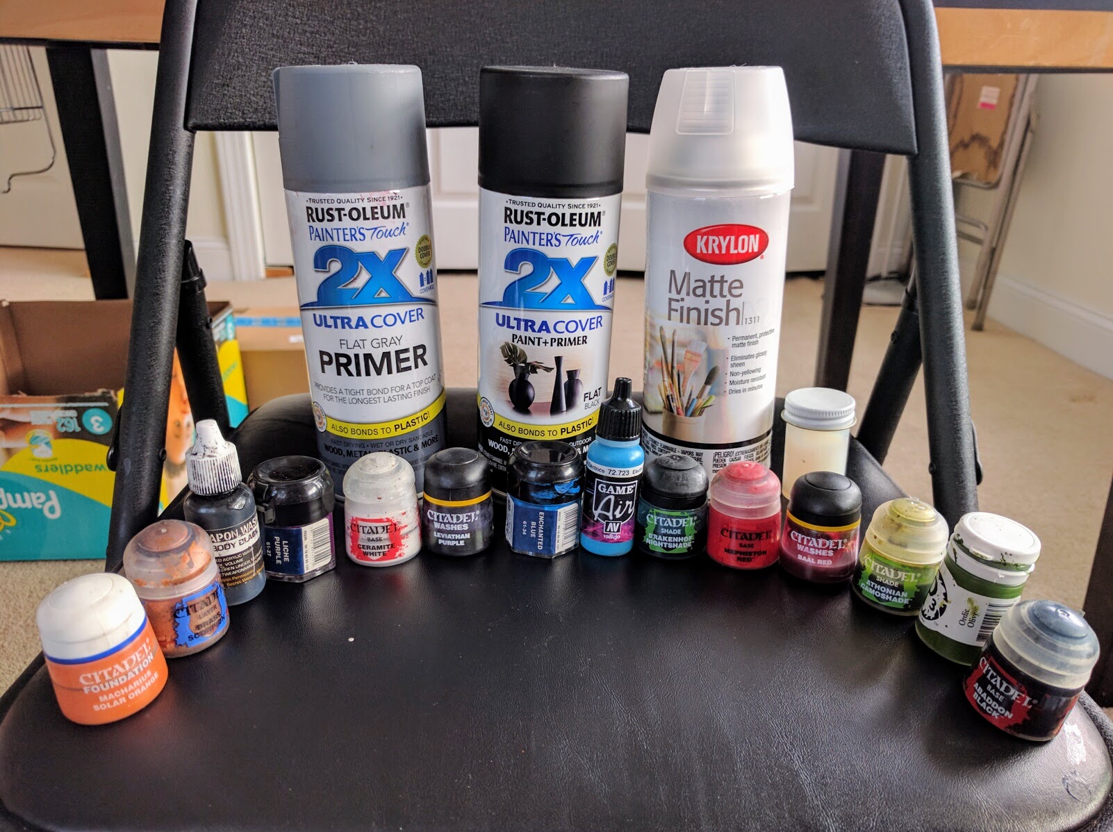
All of the paint & sealants used in this repaint, many more than are really necessary!
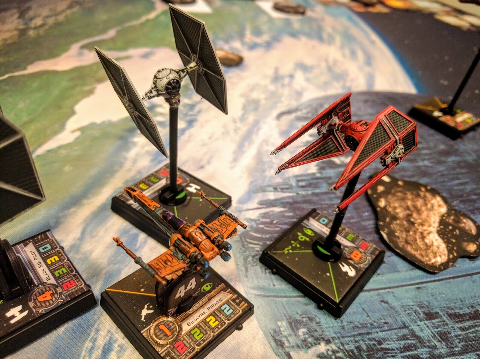
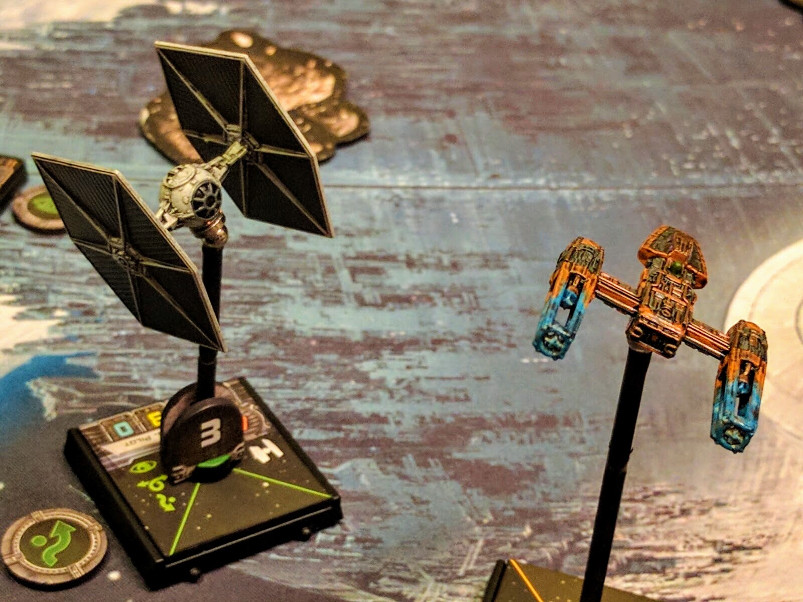
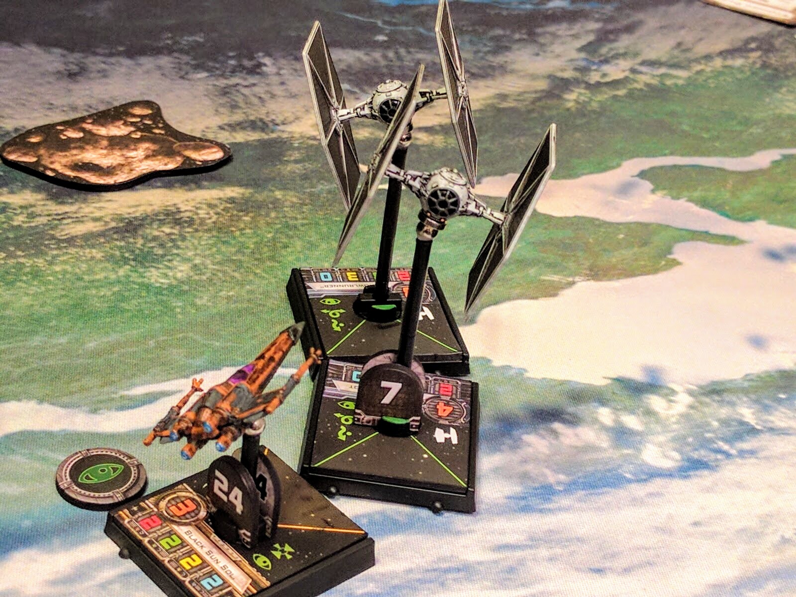
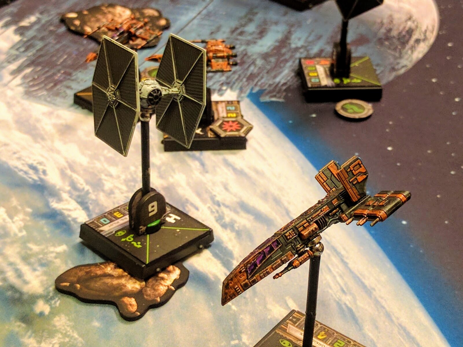
Action
That’s it! It might seem like a bunch of steps, but they’re all small and quick. I did the blacking and priming late one night and then did everything else in the morning before anybody else got up, so it’s not a very time consuming process. Wrapping up, these are a few action shots from a game with my buddy Matt to show how they look on the tabletop. I hope you enjoy the look, and got something out of this tutorial!